
FutureDanger is an American news link Heatmap Dashboard.
Achieve situational awareness of multiple threat indicators in one view.
You may have noticed the traditional media dissembles. It disguises and conceals the truth. Even when the truth is not being hidden, your attention is being misdirected. You are focused on some things, to distract you from what is actually happening. On October 8th, 2015, this website launched. For the first time on the web, in five minutes or less, you have the ability to keep track of the day’s most important news in a single view. FutureDanger assembles the mainstream and alternative media. We collect their news and recast it for you to understand what matters. We gather hard truths in one place.
Here is how to use it: First, hit the homepage and get the overall context of the news. FutureDanger Indicators are common sense warning signs. The colors of the Indicators will tell you what is heated. In other words, what the evidence currently is. The combinations of Indicators can get very interesting. Seeing what is active at the same alerts you to what the left hand is doing, while the right hand is busy. Next, read the headlines. See what the evidence is. Finally, click news links to visit the source. Get the details you need to understand fully. Alternatively, click the Indicator Title and get the full running history. See how an individual Indicator is trending over time.
This is an original, independent American Veteran-owned website supported by our advertisers. To sponsor us, click here.
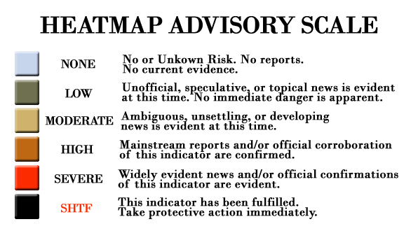
The Indicator Threat Grade System
A HeatMap is a graphical representation of data as colors. We use colors to show the relative dangerousness of current news. That is the ‘heat’. The ‘map’ part is more complex. This is not a geographical map. Nevertheless, it is a symbolic depiction of the relationships between elements of a certain space. That space is FutureDanger – a zone of risks to the American people. We show this ‘map’ by sorting the four major categories of news into four columns on the dashboard. We group Indicators into one the four categories. In general, the columns represent threats to Liberty (column 1), Security (column 2), Economy (column 3) and from Nature (column 4).
Indicators reside under their respective columns. They always have a threat grade. When there is no evidence of them, they are carried as ‘inactive’ and appear on the HeatMap as empty blue bundles. Indicators become ‘heated’ by news. News links are posted against Indicators are evidence that an Indicator is ‘heating up’.
Normalcy Bias is a common, well-understood mental state in people. When facing danger, it causes people to underestimate the possibility and effects of risk. If your reaction to the HeatMap is to call it a doomsday website, your normalcy bias may be too acute. This is a crisis-warning website. Low-grade news, represented by green and yellow Indicators, is very common. Multiple red and black Indicators are not. When multiple Indicators go very hot simultaneously, crisis conditions have begun. It can happen fast. Use this news portal to see coming. See it coming on this website first. Get ahead of crises. Warn others. Be prepared.
The Writing is on the Wall.
We will show you how to see it.
Be prepared.
ΜΟΛΩΝ ΛΑΒΕ.
Frequently Asked Questions…
+ What does FutureDanger do?
FutureDanger strives to become a leading source of breaking news for the preparedness community. It is a “news radar” of handpicked news stories. We don’t just “aggregate” news – we curate it in real-time. Real people on our staff do the dirty work of categorizing, ordering and separating stories so they make sense. We put news into context. The purpose is to provide advanced crisis warning for prepared Americans to make final provisions and informed decision-making concerning strategic relocation in the event of a disaster.
+ What does FutureDanger monitor?
We monitor political, military, diplomatic, financial, economic, natural and societal events. Our Indicator System, described in detail below, covers commonly recognized precursors to all kinds of crises. Civil disturbances, international hostilities, domestic attacks, disasters, loss or excess of rule of law, economic collapse, pandemic outbreaks, or similar catastrophic incidents are all covered.
+ Who benefits from FutureDanger?
The people who may benefit from this new and unique website are among the growing movement of Americans actively preparing for emergencies. It lets them immediately recognize disruptions and threats requiring a response. Just as importantly, they can see when not to over-react. For members of the 4 million strong Preparedness Community, who need objective Situational Awareness of events that may be leading to a crisis, this website helps them. To bring this benefit, we work to be constantly up-to-date, dispassionate, and trustworthy.
+ When looking at the homepage, what exactly is going on?
The first objects people see are what we call “bundles”. They look like Monopoly game property cards. A bundle is the home to one Indicator. When news is evident of the Indicator, a cluster of externally linked headlines is positioned underneath. Bundles are colored according to the FutureDanger Advisory System. This is a color-coded threat scale. It is applied to every bundle at all times. The color communicates the current risk of the Indicator becoming fully realized.
An “active” bundle is one that has a one or more headlines linked to it. Active Bundles have a Threat Grade elevated above the lowest level, which is blue. Blue bundles sit lower down on the homepage. They have no immediate risk of their Indicator becoming realized. They are “inactive” and never have headlines linked to them. Instead, they have a report button for users to send us a Field Report. A Field Report is a means for a user to send an anonymous tip or news article links. If we agree with a report, we will quickly activate the bundle.
For “active” bundles, green means low risk, yellow moderate, orange high, and red severe. The final Threat Grade color is black. Black means the Indicator is happening to its fullest, most dangerous extent. In other words, “Stuff” has “Hit the Fan”.
When viewed as a whole, the homepage is a type of “dashboard”. Software dashboards are commonly used by Governments and Corporations as intelligence visualization tools. Ours provides an at-a-glance view of every Indicator’s status. It is a visual interface to identify clusters of risk to American Citizens.
+ What does an individual Bundle tell the user?
We tell users what the implication of the news is. Most people do not want to know the implications. For people who are not going to cope with major emergencies, these implications are not for them. For those who chose to understand, there is a hypothetical proposition within each bundle. News stories posted underneath the Indicator Title are the “antecedents”, the first half of a hypothetical proposition. Think of news stories as evidence.
Headlines are the antecedents because Indicators are the “consequent”. They are the “then” part of an “if-then” statement. For example, one of our Indicators is the “Stock Market Crashes”. Every American can agree that would be a very dangerous event. Dow drops of triple-digits make people take notice. There will be news stories. We watch the markets and post articles when financial news gets serious.
As situations develop, either the news gets better or it does not. We either post evidence as it becomes available or stops posting and let the older stories expire. So if market news settles down, the Indicator “cools off”. No news is good news in this system.
FutureDanger also finds relationships among different stories and exposes patterns. Military Intel guys have a saying: “One report is information, two reports are intelligence.” And as Aristotle maintained, “The whole is greater than the sum of its parts.” As situations develop, we try to bring relevant data points to the same Indicator to show full context.
+ What does the full Heatmap Dashboard tell the user?
When users “zoom out” on the homepage, they get a “bird’s eye view” of all the active Indicators. This lets the Heatmap Dashboard tells them something bigger. They take the overall “temperature” of the news. Seeing many simmering at green and yellow grades means conditions are fairly normal. When some start to glow orange and red, it is time to dive in, pay attention and read the headlines. When several Indicators turn red hot, it may be time to take action.
The website is designed to a look regularly, check the thermometer, and get back to daily life. Searching the news can be like seeking a needle in a haystack. The color of the Heatmap Dashboard will let you know if it is time to take action.
+ What does the “report” button on the blue “inactive” Indicators do?
Click the “report” button to send FutureDanger a news tip. This could be a link you think is good evidence. For some events, it could be on the ground reporting, directly from the people living the incident. In these cases, FutureDanger will publish the news directly to our audience.
+ What is happening on the Heatmap over time?
The “terrain” of Heatmap is the four columns. Each column is organized to contain a certain collection of similar Indicators. FutureDanger contains custom algorithms allowing it to act as “trending software”. Without revealing the internals of this proprietary system, we can disclose that the threat grade, as assigned by our editor, is combined with factors such as time and user interest in the linked news stories.
So when you see, for example, “hotter” Indicators positioned below “cooler” ones, you can assume the items towards the top of each column have either been updated more recently, or have received more attention from the FutureDanger community.
![]()
The Heatmap Dashboard is an interactive website, allowing the user base to “have a vote” too.
+ What is the FutureDanger Philosophy?
FutureDanger is a free service to the American people. The passionate, concerned, serious prepper culture deserves a Situational Awareness tool. To deliver on this commitment, FutureDanger relentlessly pursues, publishes, and contextualizes the news every day. The value we deliver is eternal vigilance of current threats that demand preparedness. We know this information is being relied upon, ultimately, for survival.
+ What problem does FutureDanger solve?
People prepared to survive live with dilemmas. For most Americans, one dilemma is this: their livelihoods depend on living in highly populated areas. In the event of a significant crisis, retreating from urban centers is highly advisable. These urban and suburban preppers intend to evacuate as early as possible, but no sooner than necessary. Before FutureDanger, these folks needed to maintain vigilance of multiple news sources so they could to move on short notice to less populated areas. This constant monitoring is hard.
The second dilemma is the ever-increasing amount of online news. It can sometimes be a torrential downpour of information. For unprepared people, it seems not to matter. Our community, however, cannot afford to be overwhelmed by redundant news. They cannot be distracted by useless news. They do not want to over-react when the media hypes, nor under-react when the media downplays or ignores real threats emerging. And they absolutely cannot miss critical signals that should put their personal survival plans into motion.
FutureDanger is a solution. It allows, for the first time on the internet, actionable survival decision-making. We filter and consolidate fragmented signals and warnings onto one web location. We communicate the big picture of immediate major trends.
FutureDanger is an open source analysis tool, like the ones used by the Pentagon and Intelligence Community. Privately developed intelligence assessments can cost thousands of dollars and are accessible only to large corporations and elite customers. If these actors can keep their interests protected, it is time American citizens have a warning system available to them as well.
+ What is FutureDanger doing differently?
Instead of website visitors, FutureDanger has website users. The homepage is a tool. It is called the Heatmap Dashboard. It is designed to save users an immense amount of time each day. People serious about being prepared do not have time to scan each and every news story from all the sites that cover threats. The Heatmap Dashboard brings the news to one location, in a Single Operating Picture.
+ What is the FutureDanger Indicator System?
Indicators are common sense warning signs. Most Americans would agree that if only a few of these Indicators were to happen, life as we all know it would change for the worse. The Indicator System is a set of nearly 500 of these signs. These are the kind of conditions that drive people to prepare for survival. Although none of us wants them to happen, and everyone can argue about how likely they are to happen, every one of them could happen.
Breaking news stories are linked to Indicators. They are the evidence an Indicator is “heating up”. When collected in one location, our Indicators become a system for threat surveillance. Pieces of these signals and warnings can be found on a handful of other survival websites, but they frequently are not updated and never fully organized. No other website is doing this. We found a gap that none have chosen to fill.
+ What does FutureDanger NOT cover?
We stay away from partisan political stories. To the largest extent possible, we use official titles of political leaders, rather than their names. For example, when the President acts, we refer to him as POTUS, and not his name.
We never push ad hominem attacks. These aspects of the modern media environment are noise. We want to cut through that because our users need rapid situational awareness to make good decisions. Our belief is people who obsess with political parties and personalities may be wasting their most valuable resource – time. Our users focus on making faster, better-informed decisions in their daily life, without that clutter.
+ How should people feel about FutureDanger?
Appropriately calmed, if the situation warrants. Appropriately alarmed, as a situation dictates. In both cases, if they have prepared, they will feel secure.
Introducing FutureDanger
Advertise With Us

How to make a FutureDanger Field Report
How to Jump from FutureDanger Tweets to the HeatMap
How to Download FutureDanger Full Indicator Records